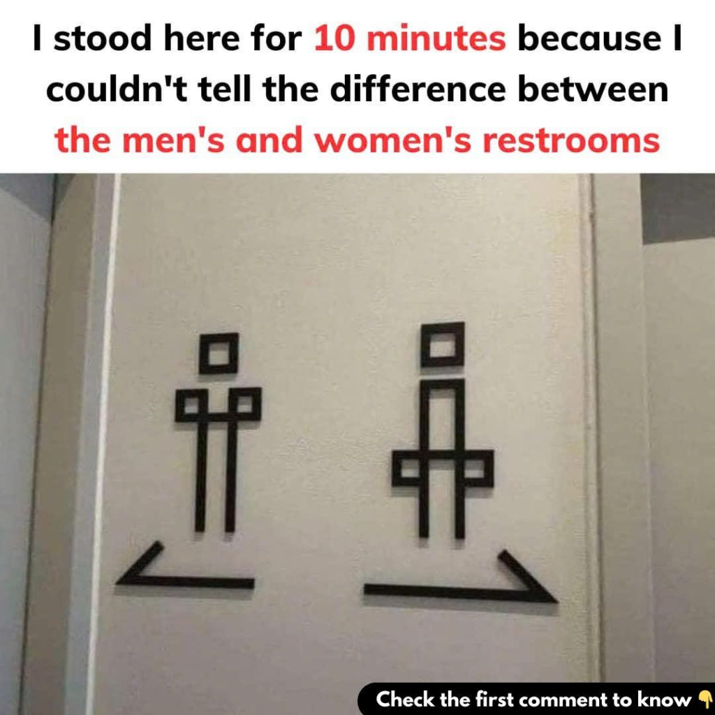
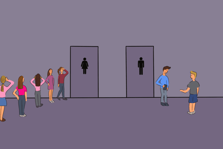
Picture this: you’re standing in a public hallway, urgently needing to use the restroom, but you’re frozen in place. Why? Because the signs on the doors are so ambiguous that you can’t tell which one is which. Sound familiar? Many of us have experienced this frustrating dilemma, which often leads to confusion and embarrassment.
What makes identifying a restroom so complicated? Restroom signs, intended to guide us quickly, are sometimes overcomplicated with abstract designs, humorous depictions, or cultural stereotypes. While businesses aim to showcase creativity and brand personality, these designs can sacrifice clarity for style.
The brain looks for instant visual cues when approaching a restroom: symbols, silhouettes, and clear text labels. When these conventions are altered, confusion arises. For example, overly artistic representations or humorous animal depictions can be amusing, but they often leave people guessing, especially in urgent situations.
As gender-neutral restrooms become more common, signs that are both clear and inclusive become even more crucial.
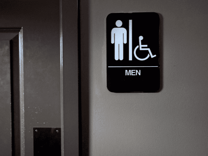
With simple, universally recognizable symbols, clear text, and inclusive options, restroom signage can be both functional and welcoming—eliminating unnecessary confusion and promoting accessibility for all